
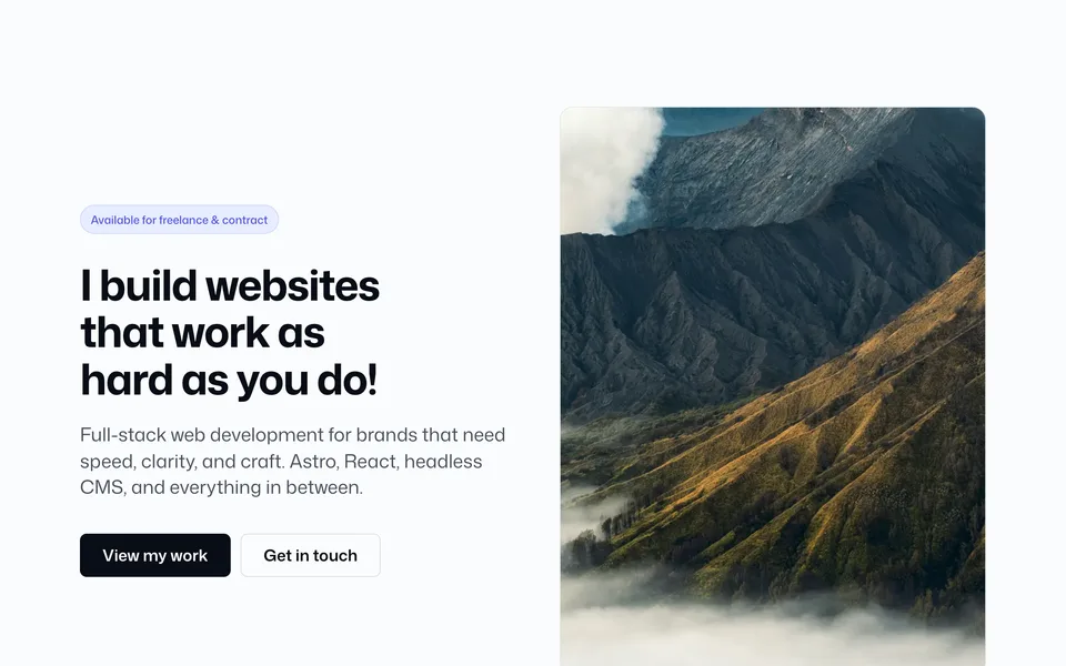
Versions
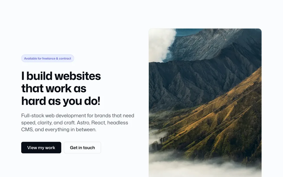
Split hero with eyebrow chip and optional stats
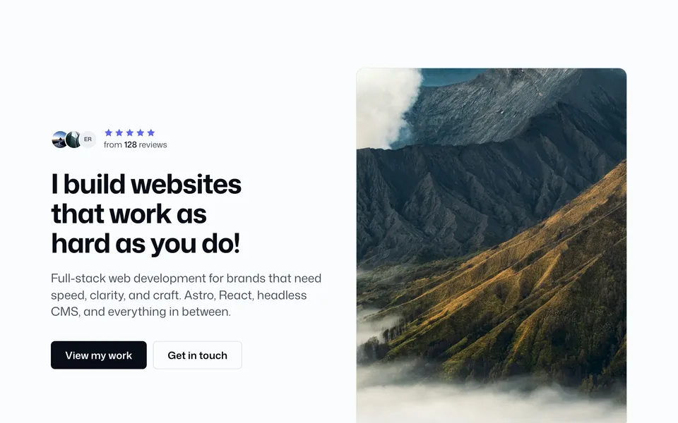
Split hero with review avatars, stars, and review count

Centered eyebrow, heading, subheading, and CTAs

Centered hero with review avatars, stars, and count

Centered hero with large image under the CTAs

Centered reviews hero with large image under the CTAs
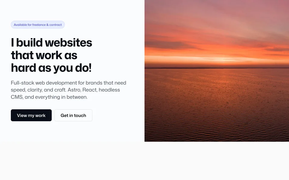
Full-width split hero with image share and height props

Centered logo, CTAs, and Lucide feature boxes

Left-aligned copy with wide max-width

Left-aligned copy with reviews (no eyebrow)

50/50 — heading left, text and CTAs right

50/50 with reviews above the right-column text

Centered hero with reusable logo marquee

Centered hero with reusable text marquee
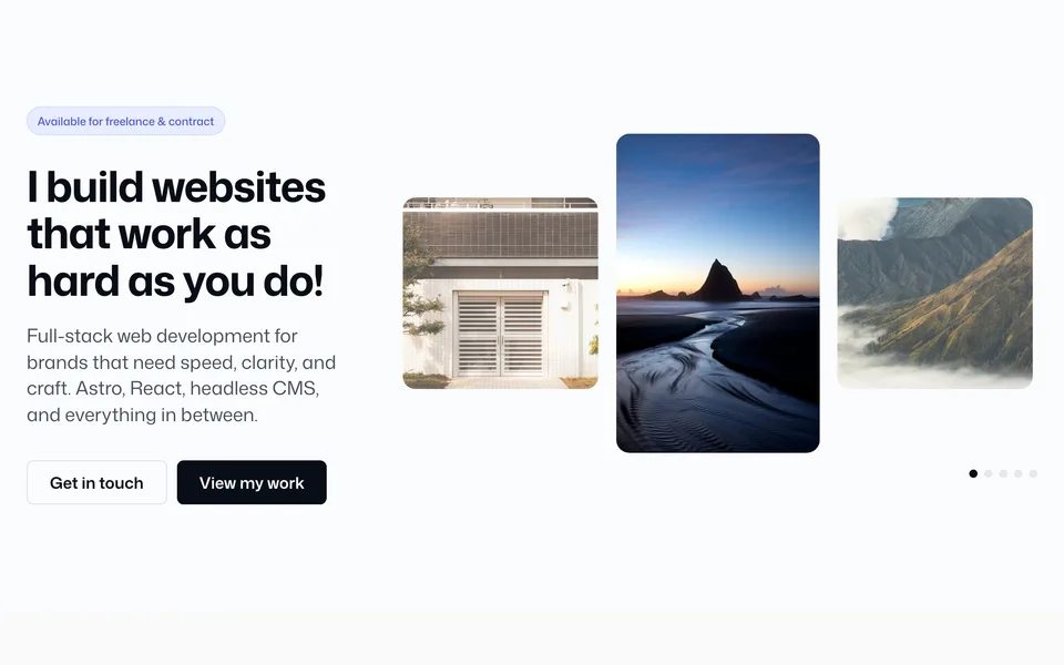
1/3 + 2/3 — copy left, center-focused image slider

50/50 — copy left, dual vertical image strips

Full-bleed slide carousel — overlay, height, placement, slider controls

Peeking slide carousel — slidePeek, gap, radius, overlay

Rounded solid frame — background color, height, width gutter

Rounded image frame — overlay, height, width gutter

Rounded solid frame + 3D dual vertical image strips

Rounded solid 50/50 — single image with backgroundColor edge gradient
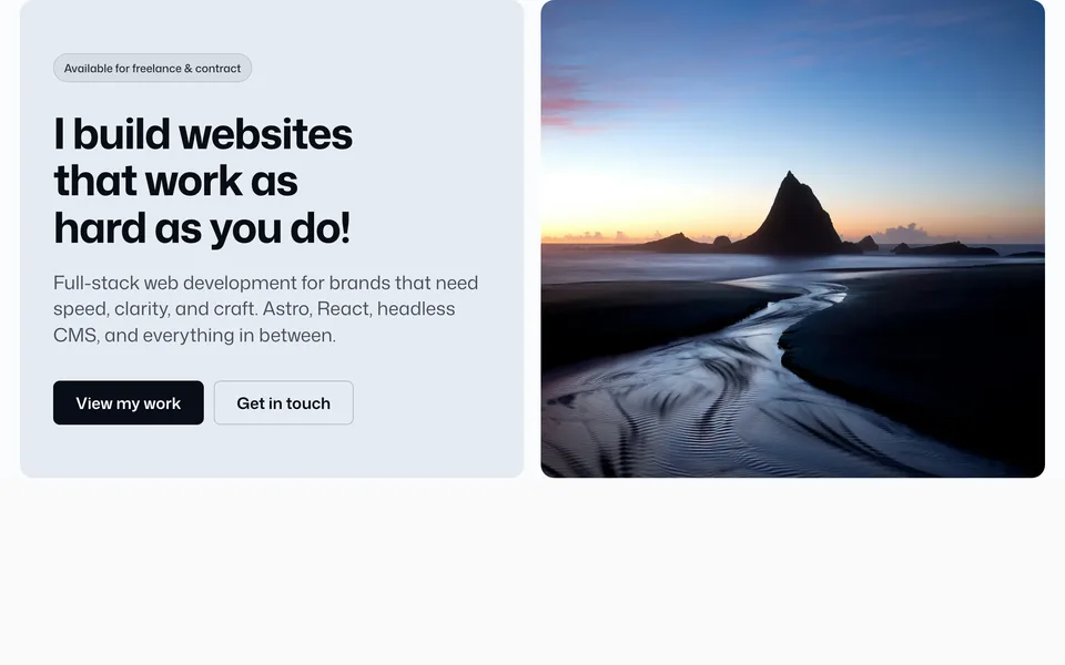
Dual-panel 50/50 — separate copy + image boxes, shared radius, gap, flip
Folder: src/blocks/hero/
Versions covering split layouts, centered marketing heroes, full-bleed image splits, editorial 50/50 compositions, marquees, image sliders, dual vertical strips, rounded inset frames (solid, image + overlay, 3D strips, 50/50 gradient media, and dual-panel boxes with a middle gap). Overlay/solid heroes use contentTone for light or dark copy.
Open a version for the live preview plus the full config and props reference (every prop, allowed values, and config key).
Photographic demos use optimized assets — see Images.