
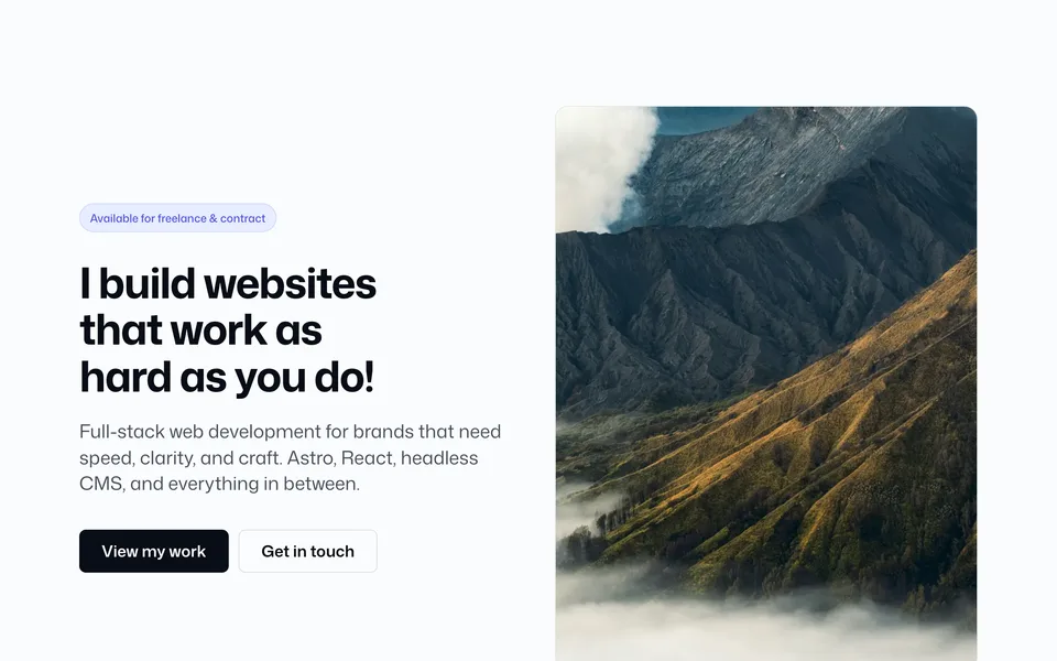

Folder: src/components/elements/
Low-level components used inside blocks and pages. No config slice — import directly and pass props.
Button
---
import Button from "@/components/elements/Button.astro";
---

<Button variant="brand" size="lg" href="/contact/">Get in touch</Button>
<Button variant="secondary">Secondary</Button>
<Button variant="tertiary">Tertiary</Button>
<Button variant="outline">Outline</Button>
<Button variant="ghost" type="button">Dismiss</Button>
<Button variant="link" href="/docs/">Plain text link</Button>| Prop | Values |
|---|---|
variant |
brand | secondary | tertiary | outline | ghost | link |
size |
sm | md | lg (link ignores size padding) |
href |
Renders <a> when set, <button> otherwise |
type |
button | submit | reset |
link is medium weight and underlined — use for editorial CTAs inside Content / FAQ blocks.
Text
Typography wrapper with semantic size tokens:
---
import Text from "@/components/elements/Text.astro";
---

<Text tag="h2" variant="displaySm" class="text-strong">Heading</Text>
<Text tag="p" variant="lg" class="text-soft">Body copy</Text>
variant |
Tailwind class |
|---|---|
display |
text-display |
displaySm |
text-display-sm |
eyebrow |
text-eyebrow |
lg |
text-lg md:text-xl |
base |
text-base |
sm |
text-sm |
xs |
text-xs |
Icon
Inline SVG icons powered by Lucide via @lucide/astro. Pass any Lucide kebab-case name (e.g. zap, layout-template, shield-check).
---
import Icon from "@/components/elements/Icon.astro";
---

<Icon name="arrow-right" size={18} />
<Icon name="sparkles" size={20} class="text-brand" />| Prop | Notes |
|---|---|
name |
Lucide kebab-case icon id — browse lucide.dev/icons |
size |
Pixel size (default 18) |
stroke |
Stroke width (default 1.75) |
class |
Extra classes (color via text-*) |
Legacy aliases (still work): bolt → zap, stack → layers, layout → layout-template.
Helper: src/lib/icons.ts resolves names to Lucide components. Used by Services, Hero08 feature boxes, FAQ, navbar, and banners.
OptimizedImage
Wrapper around Astro’s astro:assets <Image /> for photography. Accepts ImageMetadata from src/assets/images/ (optimized WebP + srcset) or a string path for public SVGs/logos.
---
import OptimizedImage from "@/components/elements/OptimizedImage.astro";
import { photos } from "@/assets/images";
---

<OptimizedImage
  src={photos.karla}
  alt="Portrait"
  widths={[480, 768, 1024]}
  sizes="(max-width: 768px) 100vw, 40vw"
  class="rounded-xl object-cover"
/>| Prop | Notes |
|---|---|
src |
ImageMetadata or string |
alt |
Required |
widths / sizes |
Responsive srcset |
quality |
Default 75 |
loading |
lazy (default) or eager for LCP |
Full workflow: Images.
Adding to a page
Elements are always inline — no blocks.ts entry. Import where needed:
---
import Button from "@/components/elements/Button.astro";
import Text from "@/components/elements/Text.astro";
---

<Text tag="h2" variant="displaySm">Custom heading</Text>
<Button href="/contact/" class="mt-6">Contact</Button>